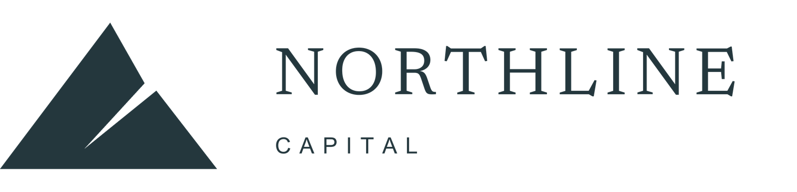
Primary signature
Full logo
The mountain symbol and wordmark together. Use where the brand is introduced.
Northline Capital / Brand resources
Our identity, clearly expressed. Logos, colour and typography for presentations, press and partner materials.
Download brand kitZIP · Full logo, symbol and wordmark · SVG, transparent PNG and PDF
01 / Logos
Use ink artwork on light backgrounds and the reversed artwork on dark backgrounds. Each version is supplied as a ready-to-use file.
Primary signature
The mountain symbol and wordmark together. Use where the brand is introduced.
Compact applications
For favicons, avatars and compact placements where the brand is already known.
Alternative signature
The existing Northline lettering. Use where space or context favours a text signature.
SVG / DigitalScalable artwork with outlined lettering. Preferred for websites and design layouts.
PNG / Everyday useTransparent backgrounds for presentations and documents. Square avatars have a solid background.
PDF / PrintVector artwork for placement in print layouts and design software.
02 / Usage

Keep the supplied proportions, spacing and orientation. Do not stretch, rotate, outline or add shadows to the mark.
Use the full logo at least 180 px wide, the wordmark at least 140 px, and the symbol at least 24 px. Use the dedicated favicon artwork for browser tabs.
Use Ink on light surfaces and Paper on dark surfaces. Place the logo on a quiet background. Avoid busy photographs or low-contrast colour combinations.
Use the full logo for first introductions. Choose the symbol for compact applications and the wordmark where the brand is already established.
03 / Colours
Ink and Paper form the core pairing. Supporting greens and neutrals bring structure to layouts. Colour never signals investment quality, risk or return.
Primary text, symbols and strong surfaces.
Primary light background and reversed artwork.
Supporting accents and quiet emphasis.
Supporting surfaces and dark-theme secondary text.
Secondary text on light surfaces.
Borders and separators on light surfaces.
Use the theme control to preview light and dark surfaces. Keep body copy in the primary or secondary text colours, not the pale separator colours.
04 / Typography
Headings and wordmark
A considered perspective.
Use regular and light weights for headings. Keep the supplied logo artwork intact rather than recreating the wordmark.
Body, navigation and labels
Clear information.
Comfortable reading.
Use a clean system sans serif for supporting information. Maintain generous line spacing and readable text sizes.
Font files are not included in the kit. Use appropriately licensed font files in your own materials.
05 / Applications
Use the dedicated square symbol files. Both are ready at 400 × 400 px, with balanced spacing.


The compact symbol identifies the browser tab. Shared links use the symbol with the Northline Capital name, so the brand remains recognisable outside the website.
Working with Northline Capital
Contact us for brand materials or a co-branded layout.